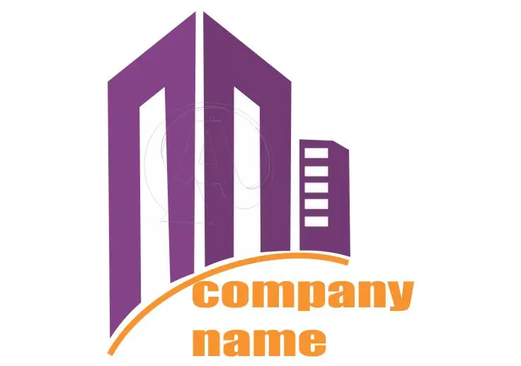
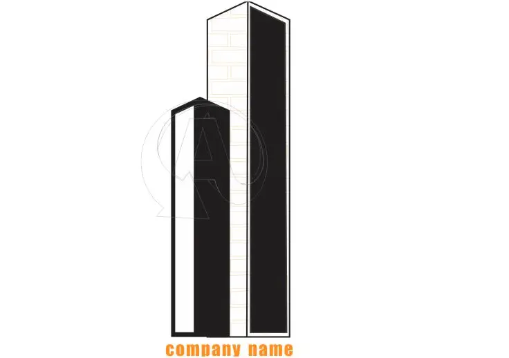
Architecture Logo Designs are custom-created visual marks that represent architectural firms, studios, or professionals in the field. These logos combine elements of geometry, structure, and creativity to convey the core values of architectural work — stability, innovation, and aesthetic excellence.

An architectural logo typically uses clean lines, bold typography, and symbolic imagery such as buildings, blueprints, or abstract geometric shapes.
The goal is to project a sense of trust, creativity, and precision that clients associate with architectural expertise.
Why a Logo Matters in Architecture
Your logo is often the first thing potential clients see. Whether it appears on your business card, website, or project signage, it instantly shapes how your firm is perceived. A well-designed logo can:
Build Brand Recognition:
A unique and consistent logo helps your firm stand out in a crowded market, making it easier for clients to remember you.Convey Professionalism:
A thoughtfully designed logo signals credibility and reliability — crucial in a field that relies heavily on client trust.Reflect Creativity:
Architecture is a creative discipline. A great logo showcases your artistic sensibility and design philosophy before a client even views your portfolio.Create Emotional Impact:
The right blend of color, form, and typography evokes emotions that align with your firm’s identity — be it modern, classic, sustainable, or innovative.
Key Elements of Effective Architecture Logo Designs
Creating a strong architecture logo requires balance between artistic flair and technical precision. Here are some essential elements to consider:
Simplicity:
A minimalistic design often works best in architecture. Clean lines and simple shapes ensure clarity across different mediums.Typography:
Fonts play a crucial role. Sans-serif fonts communicate modernity and efficiency, while serif fonts suggest tradition and craftsmanship.Color Palette:
Neutral tones such as black, gray, and white are common, but bold accents like gold, green, or blue can add a distinctive touch that reflects your brand’s energy.Symbolism:
Incorporate icons such as structures, blueprints, or monograms subtly — these convey what your brand stands for without overcomplicating the design.Versatility:
A good logo looks great everywhere — from digital platforms to architectural blueprints and physical signage.
Trends in Modern Architecture Logo Designs
As design trends evolve, Architecture Logo Designs are becoming more refined and conceptual. Current trends include:
Monogram Logos: Using initials to form a sleek, professional identity.
Geometric Abstraction: Employing abstract shapes that symbolize design precision.
Negative Space Art: Cleverly using empty space to form architectural icons.
Minimalism: Clean and timeless logos that emphasize structure and clarity.
These trends reflect the modern architect’s balance between creativity and discipline — traits that define successful architectural practices.
How to Create Your Own Architecture Logo Design
If you’re developing a new brand identity, consider the following steps:
Define Your Brand Vision:
Think about what sets your firm apart — innovation, sustainability, or tradition.Choose a Style:
Decide whether you prefer a modern, classic, or abstract design style.Work with a Professional Designer:
Collaborate with a skilled logo designer who understands architectural aesthetics.Test Across Platforms:
Ensure your logo looks great in print, on digital screens, and even on construction site signage.
Free Template Options (Download and Customize for Your Business)
Looking for ready-to-use designs?
You can download customizable logo templates from Amosnde Graphics available in various sizes and themes. These templates can be personalized with your, text, or color scheme before printing.

At Amosnde Graphics, we specialize in creating stunning Logo designs that match your brand perfectly.
Our creative team combines professional layouts, elegant fonts, and your brand colors to craft a design that leaves a lasting impression.
Need a Custom Logo from Scratch?
If you want a unique and professionally designed Logo, we can create it from scratch at Amosnde Graphics. Tailored to your brand’s identity, colors, and vision, our designs make your travel business unforgettable.
FAQs About Architecture Logo Designs
1. What makes a good architecture logo design?
A good architecture logo is simple, timeless, and versatile. It reflects your firm’s design philosophy and communicates trust, creativity, and precision using clean lines and balanced typography.
2. Which colors work best for architecture logo designs?
Neutral colors like black, white, gray, and beige are often preferred for their professionalism. However, adding subtle accents of gold, green, or blue can make your logo unique and memorable.
3. Can I create my own architecture logo design?
Yes, you can use online design tools or templates, but working with a professional designer ensures your logo is original, scalable, and aligned with your brand’s identity.
4. How much does an architecture logo design cost?
The cost varies depending on the designer’s experience and complexity of the project. Professional logo design services can range from affordable packages to premium branding solutions.
5. Why should architects invest in logo design?
A logo is a long-term investment in your firm’s reputation. It builds recognition, sets you apart from competitors, and creates a professional image that clients can trust.
Conclusion
A powerful logo is the foundation of your brand identity — just like a building’s foundation determines its strength and stability. With thoughtful Architecture Logo Designs, your firm can project professionalism, creativity, and trust to every potential client.
Investing in a professional logo design isn’t just about aesthetics — it’s about building a lasting impression that stands tall for years to come.
